CIPS
In 2021, the procurement industry was at the center of unprecedented global disruption.
Verve, acting for Hays and CIPS (Chartered Institute of Procurement & Supply), needed to transform their annual research into a compelling report that could guide professionals through a volatile market.
The project faced two primary hurdles: an overwhelming volume of complex data and a high frequency of client revisions. As the project progressed, the sheer scale of the research began to threaten the delivery timeline. We needed to maintain a "human-centric" feel while housing dense, high-stakes industrial shifts across six different global markets.
My Role & Collaboration
I served as the Art Director, initially overseeing the creative team. As the project neared its deadline with significant data still to be processed, I moved into a more hands-on leadership role. I acted as the primary liaison between the internal research team, the design studio, and the client, ensuring that technical data translated accurately into design without losing aesthetic quality.
Process & Key Decisions
- Cross functional leadership, When the project risked overrunning, I reviewed the approach, moving from oversight into hands-on programme management. I became the primary connector between the internal researchers, the design team, and the client, creating a triage system that prioritised the highest-risk data sections and cleared blockers in real time. This required making fast trade-off decisions about what could be deferred without compromising the core report.
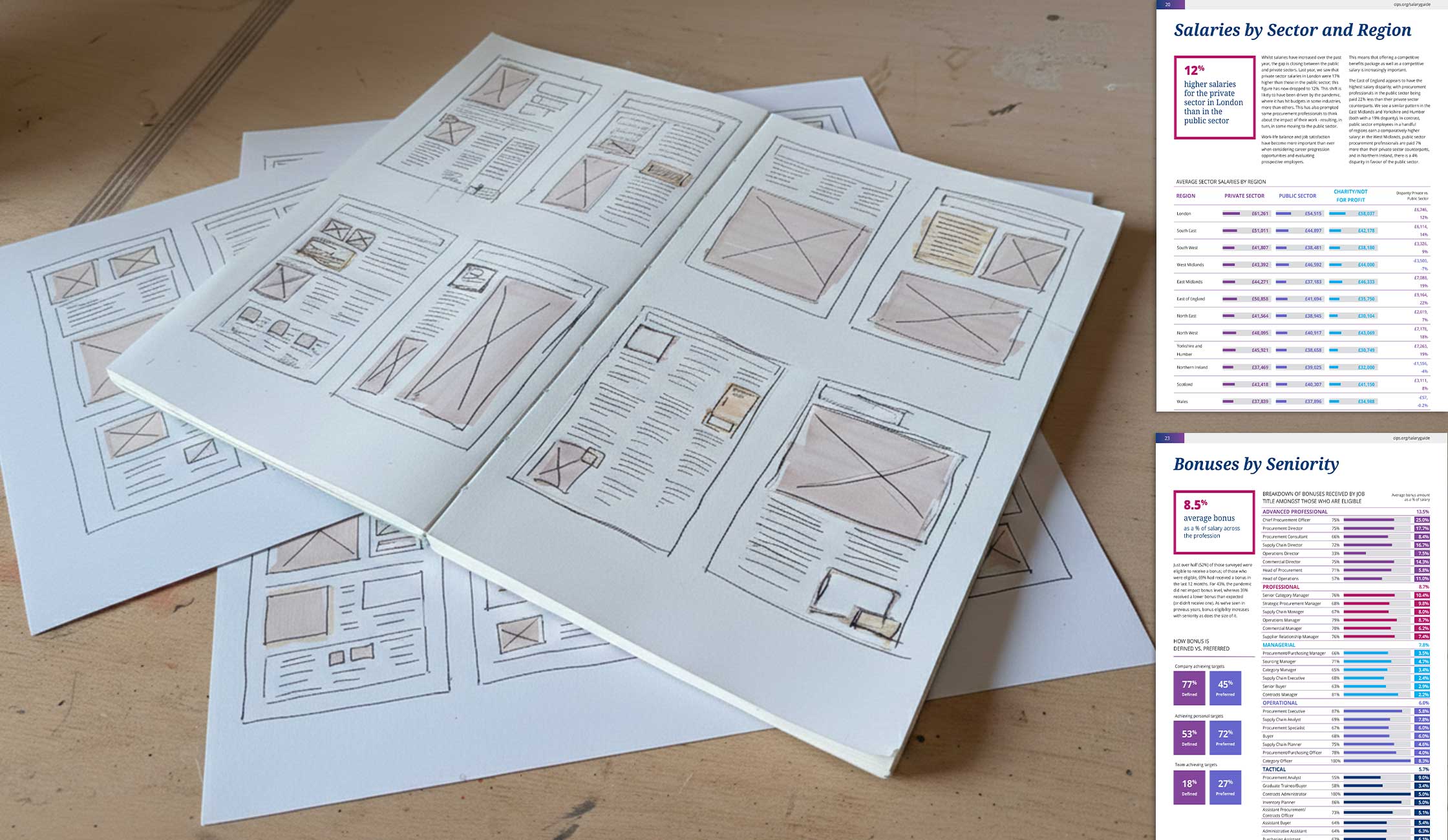
- Managing the data load: A major part of my role was managing stakeholder expectations regarding data density. I worked to balance the client’s desire for detail with the user’s need for readability, advocating for "breathing room" and modular layouts.
- Stakeholder Management: One of the most challenging aspects of this project was managing the high rate of revisions from both the client and Verves researchers. I established a structured approval cadence, replacing ad-hoc feedback with scheduled daily review checkpoints that batched client input and prevented mid-sprint scope changes. This gave the design team protected build time while keeping the clients informed and confident throughout.
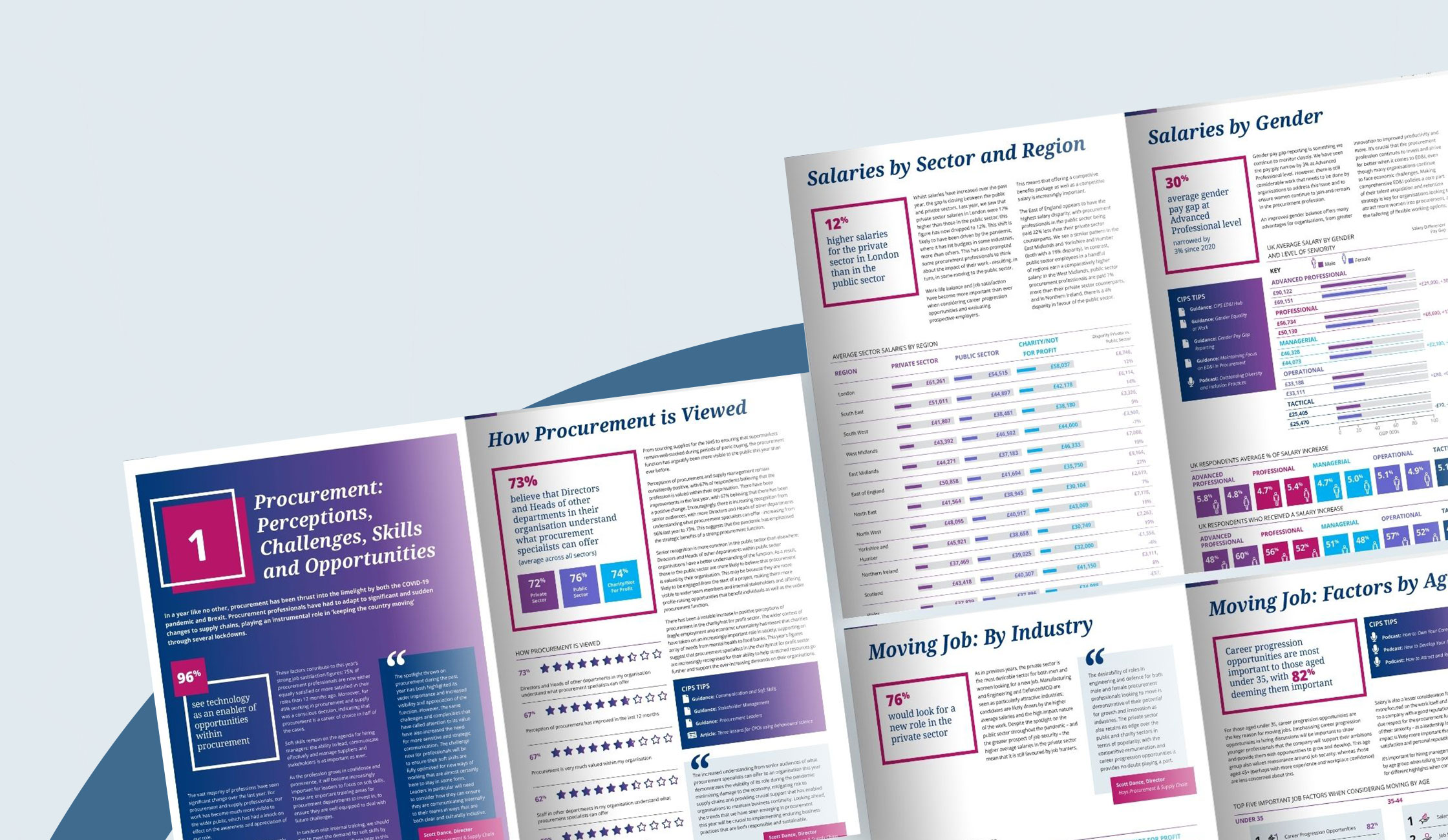
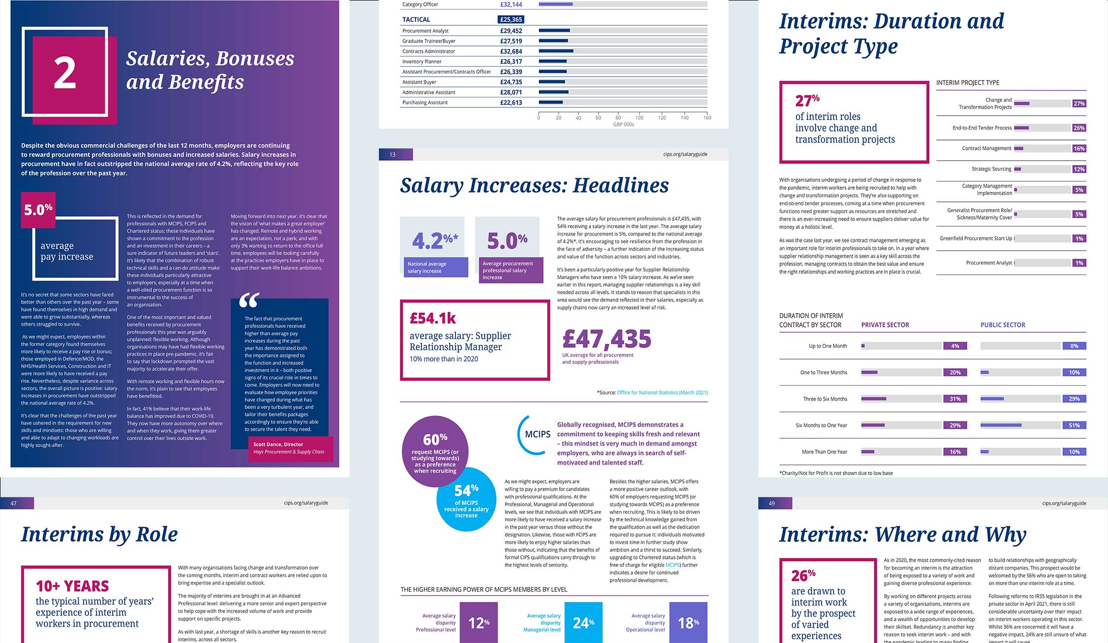
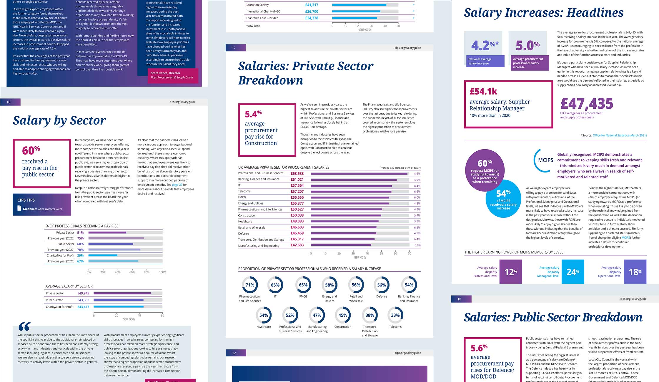
- Visual strategy, I established a "Corporate-Modern" aesthetic. We used a foundation of Deep Navy for authority, punctuated by a vibrant Magenta/Plum to highlight critical salary data and pull quotes.
- Standardizing the Complex: To make the data digestible, I moved away from dry spreadsheets in favor of a clean, linear infographic style—using horizontal bar charts for quick scanning and dougnut charts for percentage-based insights.
Delivery
Once the master global report was signed off, I led the efficient rollout of regional-specific versions for Australia, Asia, Africa, and the Americas. This required strict version control and a modular design system that could adapt to varying data lengths across different territories.
Outcomes & Reflections
The project was a lesson in resilient leadership. By stepping in to bridge the gap between researchers and designers, I was able to streamline a cluttered process and deliver a premium product on time. We turned a potential "data dump" into a tangible, high-end resource that felt like a premium editorial piece rather than a technical manual. This experience reinforced a belief that the difference between a design project overrunning and delivering on time is rarely craft but rather the quality of the systems and programme architecture around it. Clear decision rights, structured approval cycles, and a direct escalation path between design and client are as much a design output as the pages themselves.

Let’s talk
I’d love to hear from you — whether to discuss a project or simply to connect.


